

Melissa & Doug
Project Summary
Timeline 3 months
Role UX Design, UX Strategy
Team 1 Engineer
1 Designer
How might we turn screentime into a healthy and enhanced playtime?
I was tasked to research and design a mobile application from zero to one to help parents learn how playtime builds their child’s learning development skills, while promoting Melissa & Doug toys. In collaboration with a multi-disciplinary team, I delved into in-depth analysis of Melissa and Doug’s business model, crafting innovative solutions to enhance parent’s playtime experiences with their children.
Outcome
Increased user satisfaction by 10%
Introduced new parenting concepts to 75% of participants
Net increase in brand image
PROBLEMPlaytime is stressful when parents don’t know what’s best for their child’s growth
For parents, choosing toys and playing with kids is joyful for the most part. But there can also be mental burden and stress in selecting the right toys and connecting with kids in play.

SOLUTIONDesigning a story-driven app that meets childhood development goals
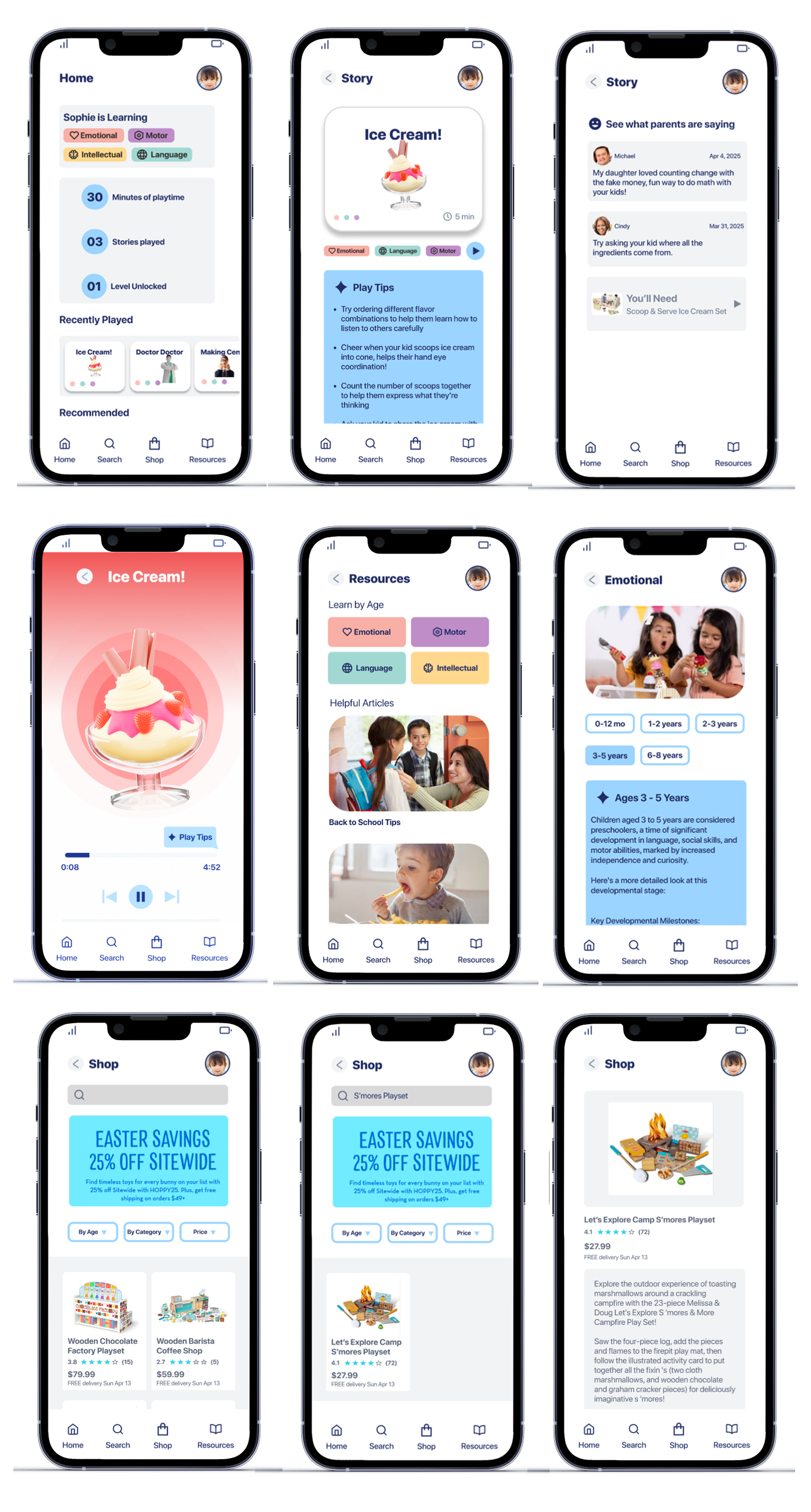
We designed a story-driven app that teaches parents how playtime builds their child’s learning development skills. Within each story, parents learn tips and tricks based on Learning Development Theories to enhance their playtime experience with their kids. They also have the option to learn more about child development skills by age and shop for Melissa & Doug toys that enhance their children’s playtime.

01
Tie playtime to learning development skills
Our app breaks down the development skills into 4 categories based on Learning Development Theory, so parents are aware of what kind of skills their kids are developing while playing.


Support parents with play tips grounded on educational theory
While a story is playing, parents can scroll for play tips to suggest helpful ways to interact with their kid that enriches their playtime and learning development.
02
03
Empower parents with educational resources
Our app provides more in-depth material on learning development by age, so parents can learn more about how their child is growing in their own time.

Final Designs
LEADING WITH RESEARCHUnderstanding our users
We conducted 6 semi-structured interviews with Millennial parents to gain insights into the expectations, needs and pain points of this generation.

LEADING WITH RESEARCHStakeholder Mapping
We identified value opportunities by creating a stakeholder map based on our research of Melissa & Doug. Spending time researching the company website and its competitors, such as Lovevery, allowed us to see the big picture and the relationship between stakeholders. We identified the key value and cash flows, which allowed us to find 3 value opportunities that inform our hypotheses. We focused on the second hypothesis and also interviewed a parent who uses Melissa and Doug products to arrive at 3 key insights.

Children are very imaginative in play
01
Children can find new ways to interact with a toy that adults often do not expect or in ways that were not originally thought of in the intended design. Therefore, it is crucial to design an app that encourages unstructured playtime.

Parents are unsure if they’re helping or hurting growth
02
Parents can experience feelings of stress and uncertainty because they are not sure if they are playing in a way that helps with building their child’s imagination or stifling it.

Parents have mixed views about screen time
03
Parents have varying views of screen time, some are okay as long as it is reasonable, “healthy” screen time that benefits their child.

DESIGNLow Fidelity Prototype
We started with rapid sketching of possible experiences with a phone that minimizes the use of screen time. Ideas ranged from monitoring the child’s mood to creating a story-time experience.


Once we aligned on a story-driven app, we crafted low fidelity wireframes with no color to focus on the interaction and usefulness of information to parents, and tested these prototypes with 4 millennial parents. Our initial designs centered around creating variations of a landing page that summarizes the child’s learning progress, preferences and learning development progress.

Usability Testing
I conducted 8 rounds of usability testing with 4 millennial parents, 2 teachers and 2 ed-tech designers, and found that displaying learning progress by development category was overly prescriptive.
Originally, we wanted to capture this information in a graph. However, we learned from educators that more extensive, in-depth evaluation is required to provide an accurate assessment of learning development skills by age. So we changed direction by giving more autonomy to the parents, having them pre-populate the tags during the onboarding phase, and matching stories with different skills, and allowing them to choose which stories can help their kids with certain development needs.
Mid Fidelity Prototype
Once we were confident in the interaction fidelity of our wireframes, we added color and conducted A/B tests to see which palettes were most appealing to our end users. We explored a calming blue aesthetic and bright color aesthetic, but in order to be WCAG AA compliant, ended up going with a pastel, playful aesthetic consistent to Melissa & Doug brand.
We also found challenges balancing the variety of colors in company branding while communicating life skill categories consistently across the app, and was more in compliance with WCAG accessibility guidelines especially for parents who are color blind.

Final Designs
The final designs consisted of the landing page with the playtime summary and recommended stories, the ability to search for stories by learning category, and the ability to shop for toys that are recommended in the stories

OUTCOMEWe achieved an increase in learning outcomes for parents, while increasing positive perception of the company’s brand
User Satisfaction
+10%
Learned New Parenting Concepts


+75%

REFLECTIONRetroactively thinking about parent and children engagement with mobile devices
Taking out the guesswork in play
In this project, I had to really think what is the quickest and easiest ways for parents to see key information they want to know for their child’s development. Through our iterations, we were able to identify what was most important and reduce the volume of non-critical information.
Creating a product that maximizes playtime
I was challenged to create an interactive experience that minimized screen time for the child, while still using the device in meaningful play and allowing the app to still be a useful resource parents can interact with on their own time. This allowed me to think out of the box and find new ways to use the mobile device, such as using audio based stories during playtime.